
Connecting to a repository
To comply with my non-disclosure agreement, I have omitted and obfuscated confidential information in this case study. The information in this case study is my own and does not necessarily reflect the views of my employer.
The problem
Users were relying too much on support to set up their repository connection.
Repository controls were tucked away in our tools menu hidden from the user.
We were unable to save user credentials when they wanted to log into the repository.
Progress indicator was getting stuck in a continuous loop.
SWT was limiting controls, which was limiting the experience.
The team knew we needed to step back and address the experience from beginning to end to make sure that we don't leave our users struggling again and simplify and streamline the setup process.
Our team
I always compare our role as UX designers to one of a central midfielder on a soccer team. Transitioning the ball from your defensive side, throughout the midfield, and up to the attack, and then providing support amongst the team
I was part of a team that consists of a product owner, a project manager, several software engineers, two QA assurance engineers, and one technical writer. I also worked with my other UX teammates during the design process. I was responsible for research, flow charts, wireframes, visual design & presentation.
The approach
With the help of PM, we were able to set up video calls with five users to talk with them about their current experience to gain a better understanding of their pain points.
From an engineering side, we were handcuffed for a long time with a framework that used SWT/Eclipse only. To improve this experience for our users, and achieve our goal, we had to modernize our framework and give us the foundation that will give us a better product for the future. We had to use HTML5 and CSS3. Without doing a complete overall of the product, it was important that the old UI framework still worked properly with the introduction of our framework we were laying down.
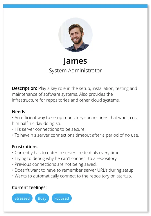
Building our persona
After those calls, I created a persona based on the information I had gathered. From the majority of our discussions, we learned that “System administrators” were the key role within our user base that were creating and maintaining repository connections.
Project framework
Flow charts
Next, I was able to begin identifying the touch points that were needed, and the path of each scenario the user would need to take.
Wire flow
Once the team had a planned-out attack for the flow of the project, I created a wire flow to help provide some context to the stories created. The wire flow illustrated a visual reference for what type of controls the UI may need.
Low fidelity mockups
After the wire flows were in place, a low fidelity mockup allowed us the opportunity to start laying the foundation out for the project.
At this point, terminology, and behaviors started to take shape. We then took the low fidelity concepts back to our users to do the second round of validations.
High fidelity prototype
Next, I was able to then create a high fidelity prototype in Axure, which used the final styles, and micro-interactions.
This was important for the team to understand when building out each section of the experience, for the flow, transitions, and timing to be correct.
It also helped the team pivot and simplify when a particular part of the experience did not feel correct.
Problem-solving
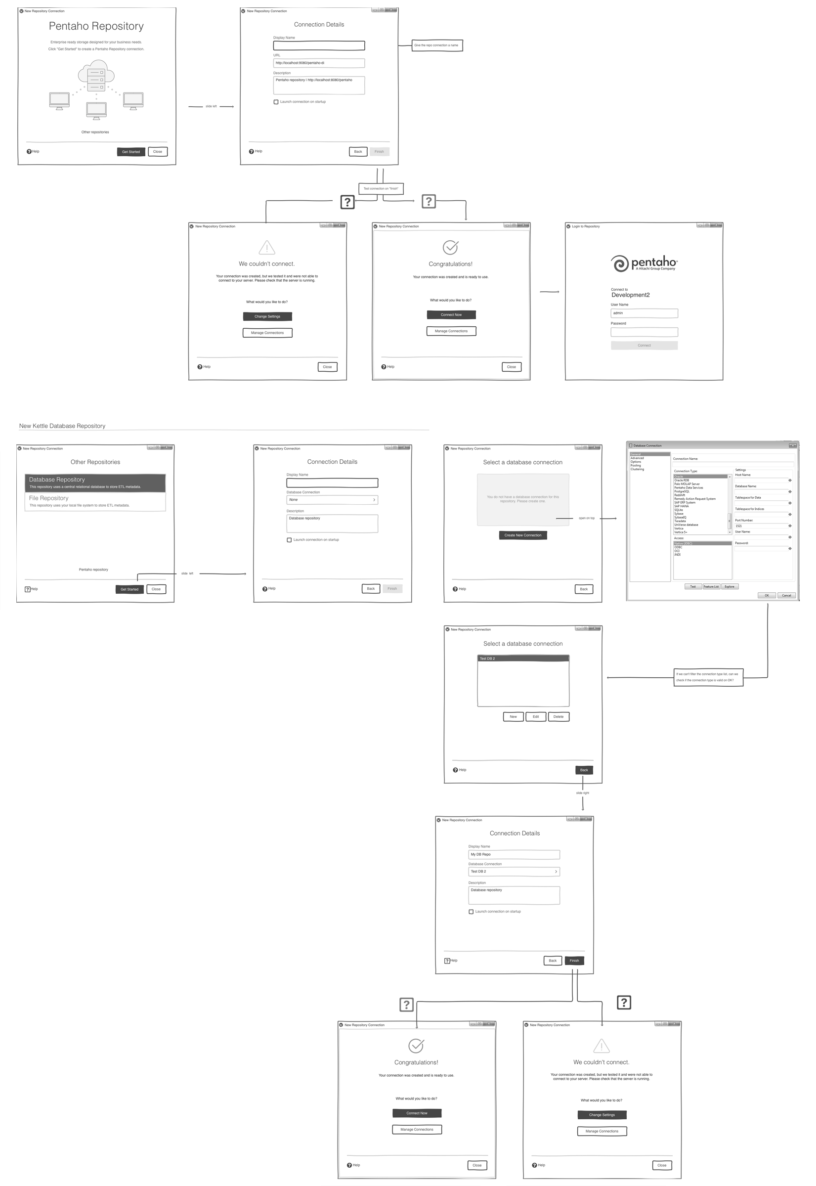
Below are examples of various areas of the experience we improved.
Solution
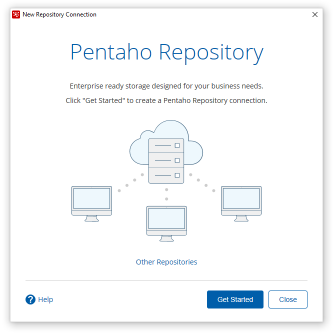
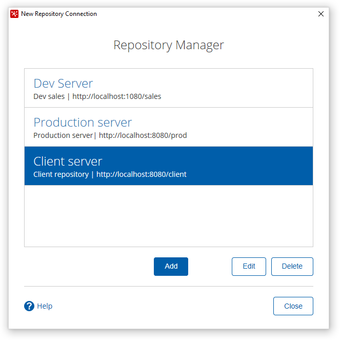
In the new experience, we introduced a connect button, which would launch the new repository connection experience, or allow the user to connect to any existing repository connections they have created right from the product's main toolbar.
Problem
In the previous experience, the entry point to the repository connection was hidden behind a menu. This left many users clicking around in frustration for such a common feature in the product.
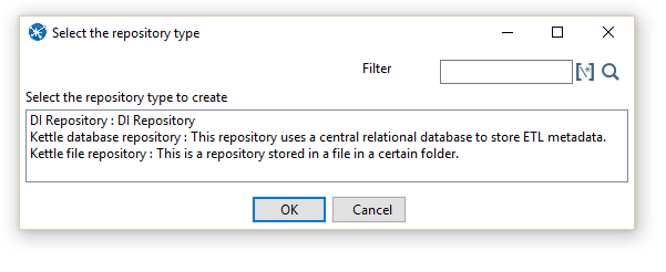
Problem
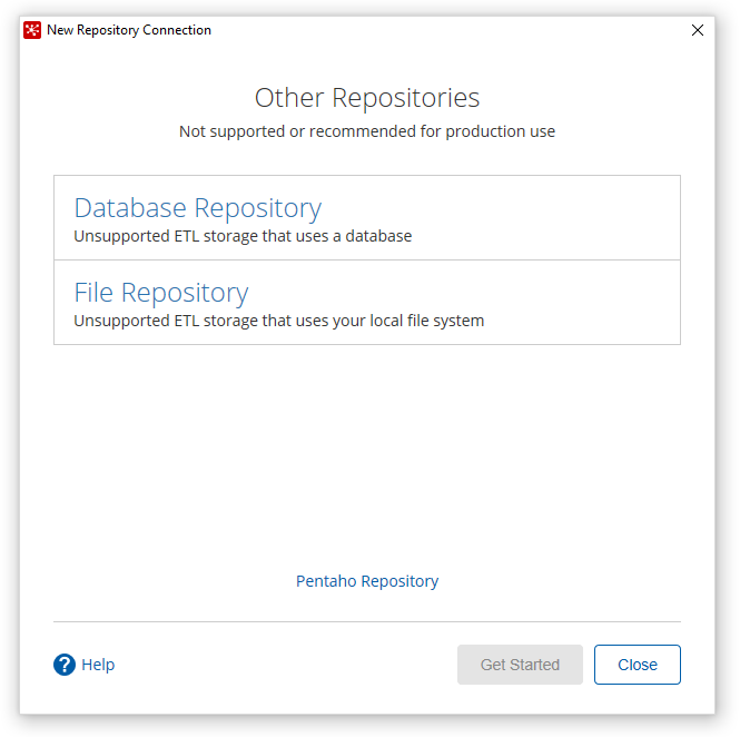
In the previous design, we had several users that were caught up when trying to choose a repository type. Our list control was not that distinguishable from a text box.
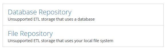
Solution
In the new design, we put more emphasis on the more common repository type amongst our users, and then also presented a more interactive list control for the other connection types.

Problem
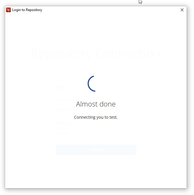
In the previous version, the progress indicator would often get stuck in a continuous loop, leaving the user frustrated and having to force quit.
Solution
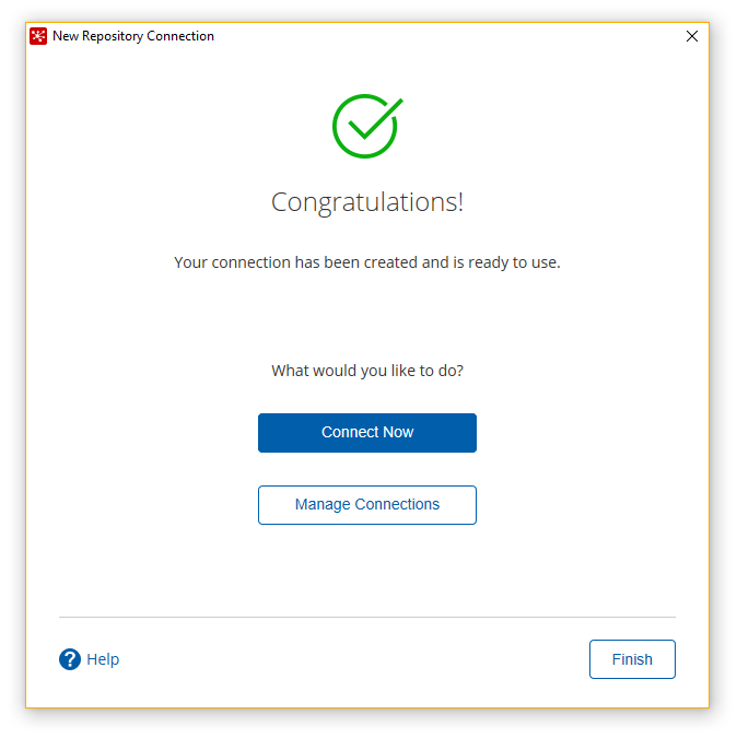
We are now presenting a micro-interaction in the UI for when the server behind the makes a call to see if the connection created is valid. We also present the user with a friendlier message during this time.
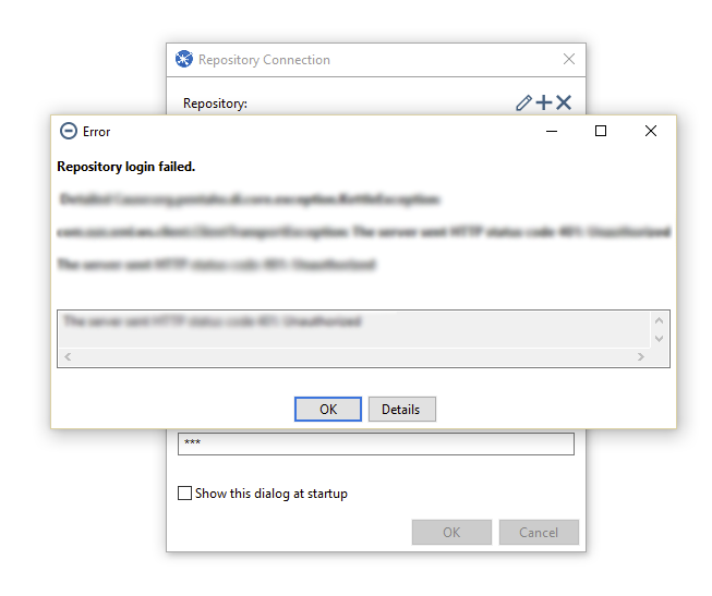
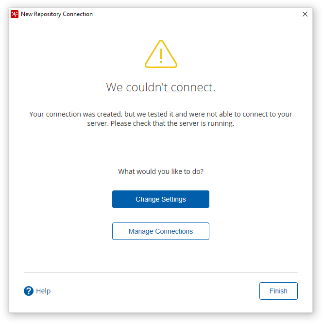
Problem
In the previous design, if the user was unable to login to their repository, the UI would throw an ugly stack trace error that wasn't very easy to debug what the issue was that occurred.
Solution
To address this issue, we wrote a series of helpful messages that slide into the UI to let the user know why they were unable to connect to their repository. Each of these messages was written specifically for what issue the user was faced with.
Detailed specs
Since we were introducing HTML5 & CSS3 to this product, it was important to define and communicate requirements to the engineering team and support our quality assurance teams in writing test cases.
One of the key deliverables was color-coded specifications that our engineers were able to toggle on and off during implementation. I was able to work with two of our color-blind engineers to define a specification key that was easy to understand and distinguish.
I also provided the style guide for the project too. This came in handy for when the engineers wanted to build out the foundation for our new style standards.
The execution
The gallery below shows some of the feature’s designs presented in high fidelity. These were the styles that our designers and QA engineers ran validations against.
Testing
Before releasing this feature, we reached out to our users who were willing to participate in our user tests. Below are some of the key things we noted:
Users liked the immediate feedback when the connection was successful or unsuccessful.
We got positive feedback on the new ‘modernized’ look.
The setup wizard was very simple to walk through. There was less discovery to what they needed to do.
They loved that they didn’t have to manually test their connection (we did the testing behind the scenes)
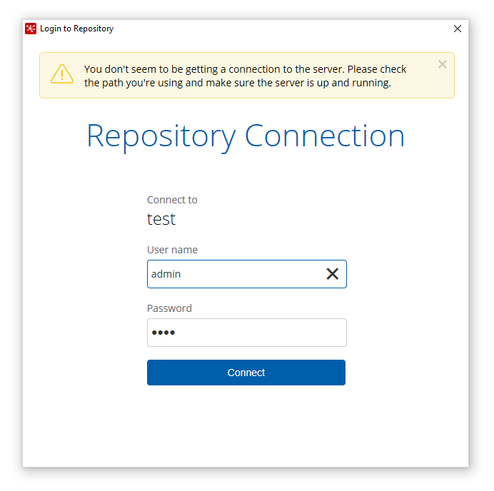
Users enjoyed that we remembered their repository settings and could log in with a single click.
We experienced some transition issues on Windows. We fixed this before it was released.
On Windows, we had some padding issues in the UI. We fixed this before it was released.
What I learned
In the beginning, I was a little unsure of about how this project would go. We had an SWT based product but were looking to introduce a revamped feature in a thin experience.
Because of time, we were not able to fully implement all the features the team wanted to do, however, we did prioritize what features were key to our user base, and got those executed.
With our new experience, we walk our users step by step through the process and also eliminate any confusion on the setup process. Since the release, we have noticed our users tickets for this feature have reduced significantly.