
Open & save experience
To comply with my non-disclosure agreement, I have omitted and obfuscated confidential information in this case study. The information in this case study is my own and does not necessarily reflect the views of my employer.
The problem
Open and save was very slow with users who had a large amount of files in their repositories.
Searching was only folder specific. They needed a way to search everything.
When trying to save, users were presented with a series of steps that were uncommon to the natural behaviors of a good file system.
Users were unable to create folders, rename folders, and rename files.
Users had no way of viewing recently accessed files.
Our team
I was part of a team that consists of a product owner, a project manager, several software engineers, two QA assurance engineers, and one technical writer. I also worked with my other UX teammates during the design process. I was responsible for research, flow charts, wireframes, visual design & presentation.
The approach
Since we were addressing both the open and save experience, I split the research into several parts.
With support engineers, we first went through through tickets of user issues.
I then did an audit of our product to capture the current open and save flows. (This was important for our team to see the current flows to help identify where we can improve)
I also captured what functionality we currently had in the open and save dialogs, and what functionality we were missing from standard file system behavior. (Windows, Mac OSX, Linux, other tools)
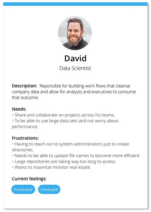
Building our persona
After reviewing our support tickets, I was able to meet with three users who had logged these issues. These three users identified themselves as Data Scientists, our tool’s primary persona.
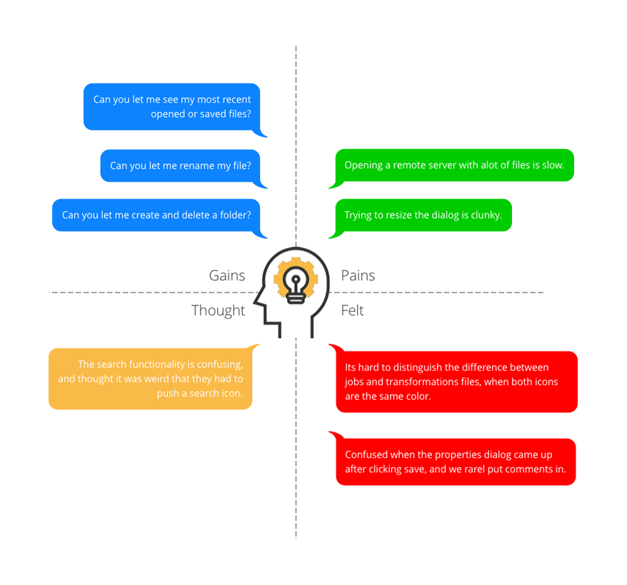
Empathy map
After meeting with our users, and building our persona, I wanted to make an empathy map to help communicate the immediate points to our stake holders. Below is a summary of some of the most common things I wanted to address:
Project framework
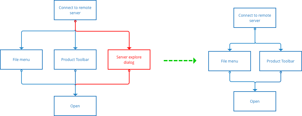
Opening files, old vs new
The next step was to capture the entry points for opening a file within our tool. The user currently had three ways of doing this:
Through our file menu
Through the toolbar open icon
Through the server explorer UI (legacy dialog).
Out of our three users we spoke with, zero of them opened a file from the server explorer dialog. From this result, this led the team to eliminate that entry point to opening a file and streamline the entry points from the start.
Old flow
New flow
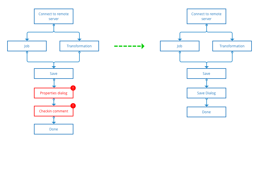
Saving, old vs new
In the old flow, our users were taken through a series of screens after clicking the save button. First a properties dialog, then a check in comment screen.
The feedback we received was that our users would continuously hit enter to go past these screens.
Old flow
New flow
Identify current behaviors
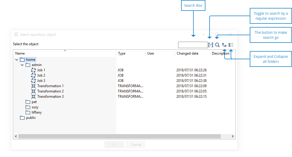
Next, I did an audit of what functions we currently had in our open dialog.
Search - Only allowed searching a single folder.
Regular expression - Toggling this option allowed the user to search by a custom regular expression.
Expanding and collapse - These toggles will expand and collapse the entire folder structure, which included children.
Since we previously did not have a save dialog, there was no audit of existing functionality. This is where the user feedback and requests came in key, it helped us identify where we should begin with planning around functionality.
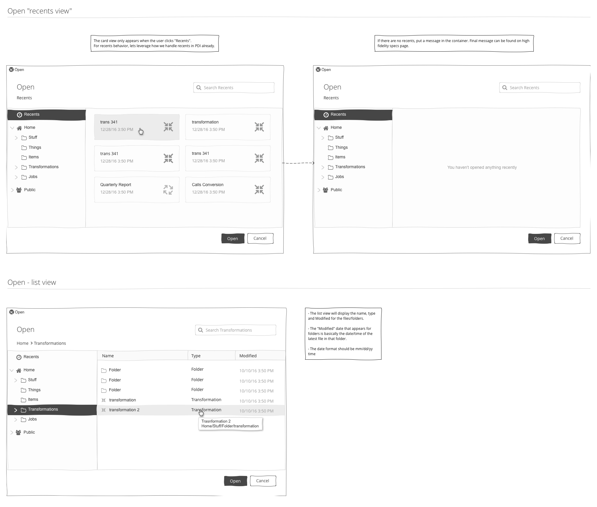
Wireframes
After some preliminary sketches, I wanted to make it clear about telling the users story to our engineering team through wireframes.
Below are some example screenshots taken from the wireframes, however, in the full scope of the project, I also covered the following:
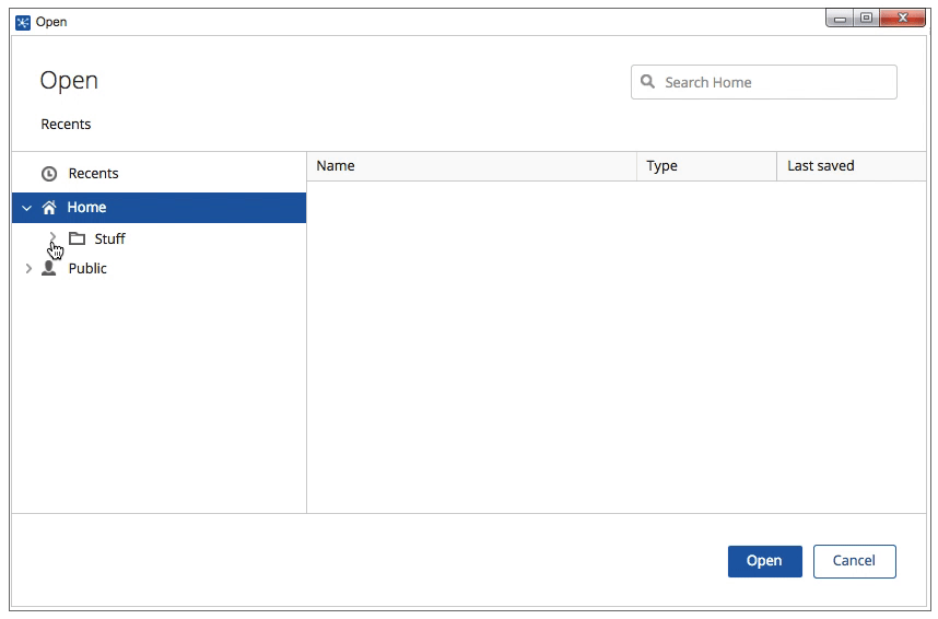
Recent view - Displayed your last 12 opened files, and would expire the list after 1 month.
Icons to distinguish each section of your structure: Recents | Home | Folders | Public
Icons for distinguishing between file types: Transformations | Jobs
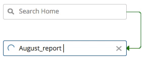
Global search - Searching within your entire repository.
Breadcrumb control, and context menu for deep folder locations.
For our new save dialog, there was more storytelling to do. Below are some example from the wireframes.
Creating and deleting folders within the repository.
Renaming files and folders.
Global search - Searching within your entire repository.
Breadcrumb control, and context menu for deep folder locations.
Responsive
We next thought about responsive behaviors, that way our users were able to leverage as much of their screen real estate as possible.
Micro-interactions
In the instance where the users repository contained thousands of files, we introduced micro-interactions to support our performance improvements. Lazy-loading animations helped keep the user informed as their folder structure loaded.
The final piece of micro-interaction we introduced was for when a user searched a folder for a specific file in a folder that had lots of files. On return, the busy indicator will appear to let the user know that we were making their search happen, once the file was found the indicator would then disappear.
Detailed specs
Once it was time for the team to execute the vision, I provided the team with detailed specifications. This was the second project that the team had built using a thin framework. These specifications were also added to the kitchen sink the design team had started to create new elements for our product.
The execution
The gallery below shows some of the design of the feature.
Testing
Before we were ready to roll out with this feature we let our users test out our improvements. Below are some of the results we got back from our tests:
Saw an improvement of approximately 80% to load performance (engineer performed tests).
Long folder names were not truncating properly in the folder breadcrumb. We fixed this upon release.
Renaming of folders was not persisting once the dialog closed. We fixed this upon release.
Positive feedback about the new UI, responsive behavior and micro-interactions.
Searching globally throughout an entire repository helped our users find what they needed much quicker.
What I learned
The biggest thing I learned on this project is that you can easily take for granted the experience of saving and opening a file. When you are building for a user, you must always wear an empathetic hat. The challenge of building out this experience is that it will perform differently amongst your users because of their repository sizes. Taking that into consideration, we had to always make sure that the user had continued feedback when things behind the scenes were happening.
Amongst our users, we’ve received some fantastic feedback. We’ve been able to address their needs, as well as most importantly, help them access their files in a quicker time frame.